Gaea21 is a non-profit association under Swiss law that pursues an ideal social goal: implementing sustainable development and Agenda 21. It is a vast network of skills and a think tank that introduces the participatory dimension of the public at the heart of its action.
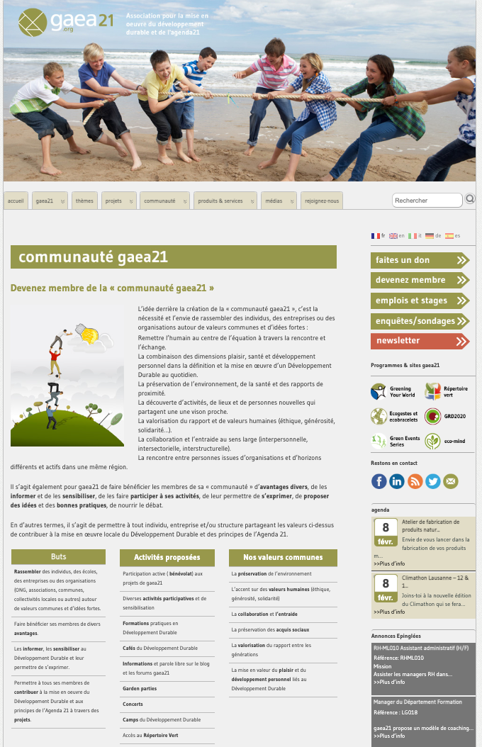
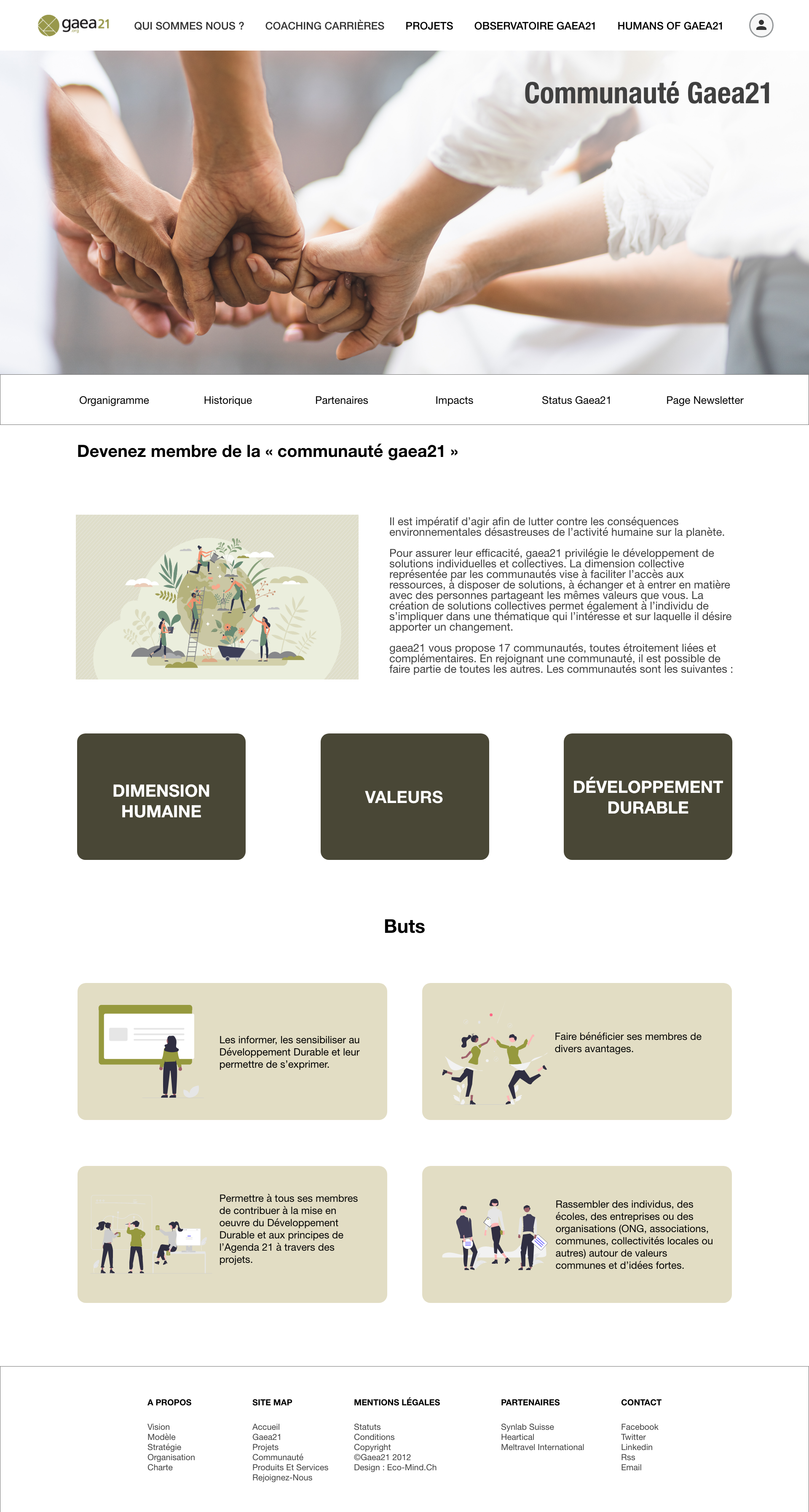
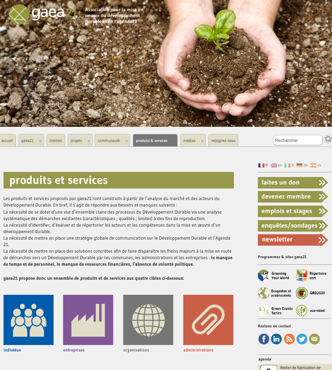
I was in charge of re-designing the website and creating a better user functionality experience to improve usability, rebranding the site (improving the look and feel), and increasing the conversion rate. I help improve both quantitative and qualitative requirements.
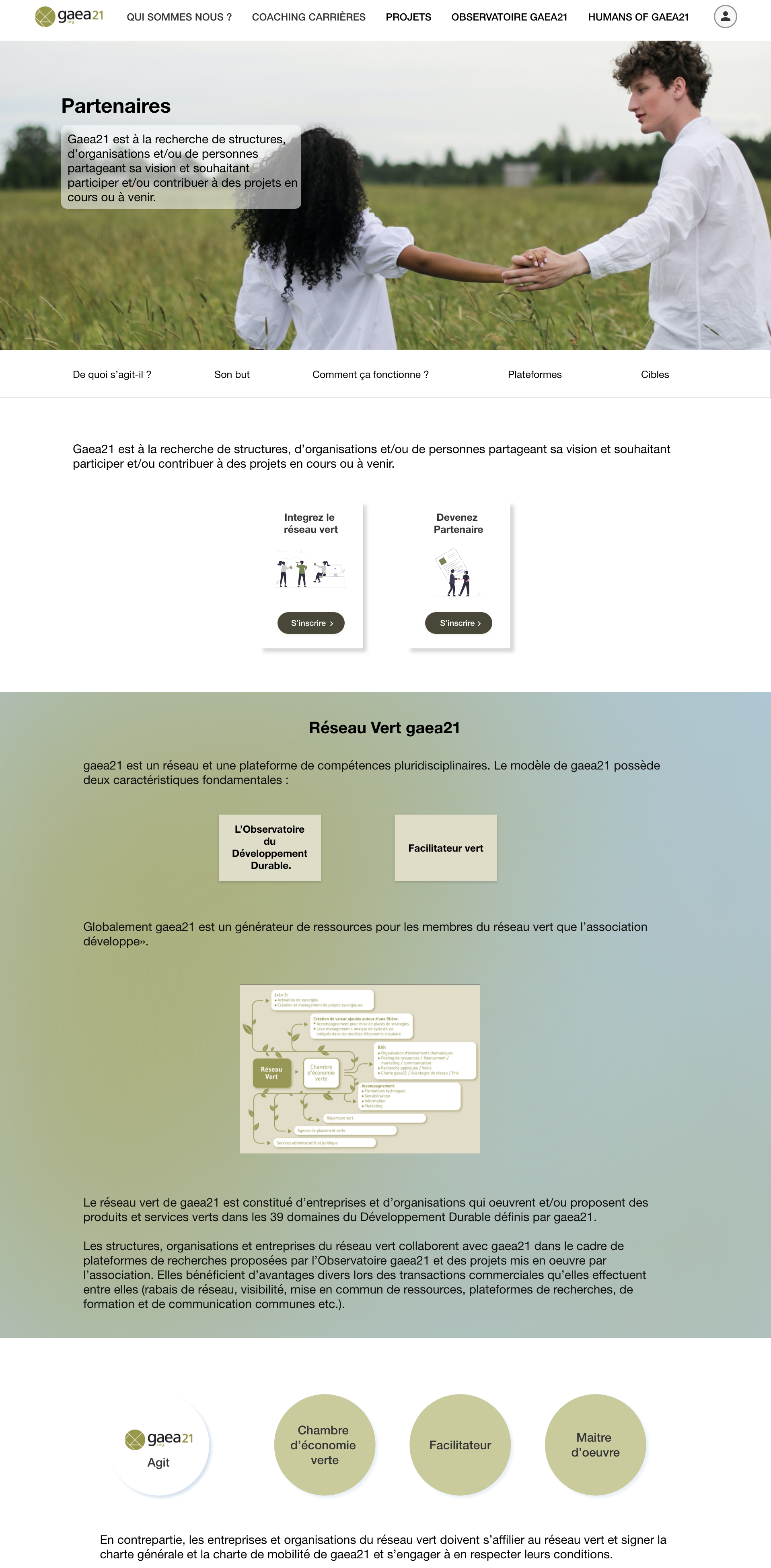
I worked on several factors such as consistency, colors (using only one dominant color for the whole website and completing the design with complementary colors), typography, imagery, simplicity, and functionality that improved the website design.
At a general level, we can observe two significant changes. First, we can appreciate a cohesive brand identity, making pages look consistent. I designed every page using the same structure, elements, and color scheme. Second, I lowered the cognitive load by reducing the features and options that appear, and I have achieved that by avoiding visual clutter,
Problems to Solve
- Too Many Options (Hick’s Law)- The more options a user has, the more time it will take to decide.
The organization of the information. A comprehensive eye-tracking study by the Nielsen Norman Group found that users tend to follow the F-Pattern when scanning pages online. This means that they first read the headline, then watch a few points below and then read the first sub-heading, after which they barely scan the content in a downward direction to see if there’s anything useful.
UX Fix
- Use categories to group similar options together.
- Use collapsible menus to hide extra options until they are needed, to avoid giving to the user too many option at the same time.
- Give them a few relevant options.
- Using heading and subheadings. Ensuring they look more important, and are more visible, than normal text so users may distinguish them quickly.
- Visually I had group small amounts of related content — for instance, by surrounding them with line as a border.
- Prioritize the information
Problems to Solve

- Lack of white spaces, reduce readability.
Whitespace not only creates harmony, balance, and helps to brand a design, it can also be used to lead a reader from one element to another, and boosts readability and guides readers' eyes.
UX FIX
- Use white space in avantage, white space refers to the areas around elements on a page that are empty and lacking content or visual items. White space is an essential design element that helps you break up the page and increase readability.
- Including graphics like product photos and web design illustrations to help users understand the text they're reading. Graphics provide visual information about products, add color, and give structure to website content.


PROBLEM
- Understand How People Scan Pages Online
A comprehensive eye-tracking study by the Nielsen Norman Group found that when scanning pages online, users tend to follow the F-Pattern. This means that they first read the headline, then scan a few points below and then read the first sub-heading after which they barely scan the content in downward direction, to see if there’s anything useful there. So all the information that is actually on the right side of the page is not having the attention of the user.
- Eliminate Unnecessary Steps
The amount of work a user needs to do must be kept minimal. Every step, no matter how small, makes a difference. Weed out all possible redundancies to give users the shortest route to their destination.
UX FIX
1-UX Fix:
- Write compelling headlines, and highlight them with large font, bold text or color.
- Use small paragraphs and bullet points that are easily scannable.
- Highlight important parts of your copy to attract attention and easily convey key points, by illustrations and different colors.
2-UX Fix:
- Automate actions and use smart defaults wherever possible
- Eliminate any non-essential clicks.
- Prioritize Scrolling over clicks.
- Keep it simple, not walls of text
.

PROBLEM

